Sometimes it feels like the university archives are bursting at the seams with print material from past events held on campus. When I was interviewing for the position one of the questions asked of me was, how will you work with the limited space we have, yet continue to grow? Part of my answer was to assess the existing material and make sure we had the right amount of copies. It is standard for archives to have no more than three of the same item for this reason. When I first started there were piles upon piles of posters sitting in the archives. I began to realize many of these were extra (extra) copies of what we already had enough copies of. I have started to sort those out.*
Such was the case with theater posters of past productions. This last fall the Trinity University Archives Student Advocates held a poster party where people got together to describe dozens of theater posters for easier discoverability. In all, they described just over 110 posters dating back to the mid-1960s through the end of the 1990s.
Museum Studies intern Hazel Myhand continued this work in the spring to clean up the description (to make it sound uniform) and created a digital collection curated with some of the best posters from the lot.
Here are some insights Hazel has shared from working with the collection.
The Trinity University Archives has begun the process of digitizing the theater and event posters in their collection. This involves creating descriptive information (metadata) about each poster.

Then I selected posters to digitize for the digital collection (https://trinity.contentdm.oclc.org/digital/collection/posters).
I had to assess the condition of each item, and should there be multiple copies, select from among them the most stable for digitization. I also took into account the artwork, dimensions, and the texture of the poster. In all 36 posters were selected to scan.
Theater Posters
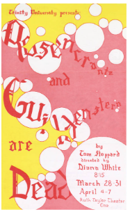
Over the years, the Department of Speech and Drama (now known as Human Communication and Theatre) has employed a vast number of styles in the posters advertising their productions.  The numerous forms that these posters take reflect not only stylistic trends of the time they were made, but also changes in the applications of print advertising, and the branding of the department.
Trifolds
Numerous posters from the 1970s would be double sided with the intent of being folded. This would allow the poster to be conventionally mailed. The recipient would be able to experience the whole of the design as they unfolded it. While some posters used their reverse to list producers and patrons, others utilized it with eye-catching details and taglines.

Broadsides
One disadvantage of these trifolds is that they had to be small if they were to fit in a mailbox, even when folded. This would make them less suitable for display on a wall or other announcement boards.
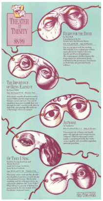
While the posters for individual productions were never standardized (barring the time they tried it in ‘85), in the 1980s and 1990s theater posters grew larger and the season posters that list all of that year’s productions quickly adopted a standardized format and style.
These season posters are as much an advertisement for theater productions as they are the department, and as such they reflect the program’s self-concept. While the 1980’s season posters had a more eclectic branding year to year (in 1986, they were the “Trinity University Players” and never were again), things largely standardized in the 1990s with the “Theatre at Trinity” era.
Thanks to Hazel and the poster party crowdsourcing help, we’ve been able to make a group of posters more discoverable and accessible. We have a detailed listing of posters from the 1960s-1990s with description about the production and the look of the poster. There is always historical interest from the theatre community of Trinity and I hope this collection is a welcomed addition to our digital resources.
*You may have been to a TUASA bookmaking event lately in which they use recycled posters. Fear not! We’ve got what we need in the archives.
Images used
1989-1990 Season Poster: https://trinity.contentdm.oclc.org/digital/collection/posters/id/1/rec/1
Rosencrantz and Guildenstern Are Dead: https://trinity.contentdm.oclc.org/digital/collection/posters/id/26/rec/17